Matlotlib & PyPlot
Contents
Matlotlib & PyPlot
In this notebook, we’ll look at plotting in a little more depth. A very common package for plotting is Matplotlib. PyPlot is a submodule of Matplotlib which offers a simplified interface (similar to Matlab).
import numpy as np
import matplotlib
import matplotlib.pyplot as plt
A figure consists of several components

(from the matplotlib useage guide)
Figures and Axes
A figure is a high level object which holds together everything in a plot. However, an Axis object does most of the work in displaying a plot. You can have multiple axis objects in a figure, displayed as subplots.
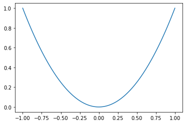
x = np.linspace(-1,1,100)
y = x**2
plt.plot(x, y)
plt.show()
fig, ax = plt.subplots() # figure with a single axis

x = np.linspace(-1,1,100)
y = x**2
ax.plot(x, y) # the axis is what actually displays the plot

plt.show(fig)

When you create multipule subplots, ax contains an array of axes
def random_fourier_fn(x, deg=3):
    A = np.vstack([np.cos(k*x) for k in range(deg)])
    c = np.random.randn(deg)
    return c.T @ A


m, n = 2, 3 # rows, columns of subplots
fig, ax = plt.subplots(2, 3, figsize=(10,10))

x = np.linspace(-2,2,200)
for i in range(m):
    for j in range(n):
        ax[i,j].plot(x, random_fourier_fn(x, deg=5))
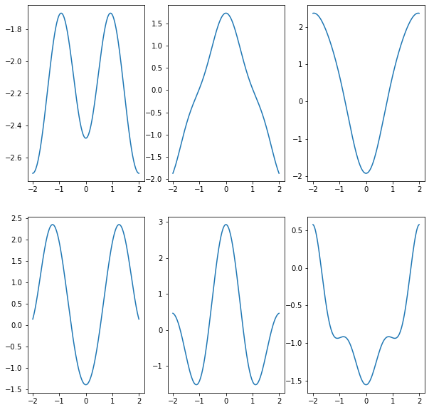
type(ax)
numpy.ndarray
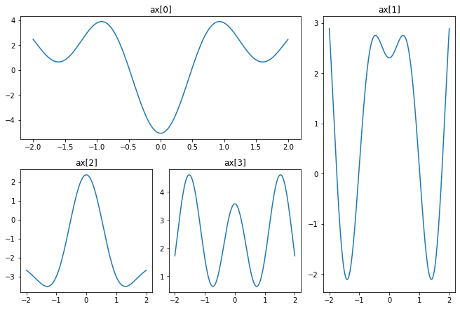
If you want to customize the location and shape of subplots, you can use gridspec - see the tutorial for more details
fig = plt.figure(constrained_layout=True, figsize=(9,6)) # figsize=(width, height)
gs = fig.add_gridspec(2, 3) # 2-dimensional grid

ax = []
ax.append(fig.add_subplot(gs[0, :-1])) # first 2 columns of first row
ax.append(fig.add_subplot(gs[:,-1])) # last column of grid
ax.append(fig.add_subplot(gs[1,0])) # bottom left
ax.append(fig.add_subplot(gs[1,1])) # bottom center

x = np.linspace(-2,2,200)
for i in range(4):
    ax[i].plot(x, random_fourier_fn(x, deg=5))
    ax[i].set_title('ax[{}]'.format(i))
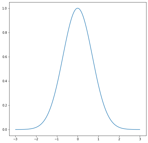
Axes
Now we’ll look at some of the ways you can control the appearance of axes
f = lambda x : np.exp(-x**2)
x = np.linspace(-3,3,400)

fig, ax = plt.subplots(figsize=(8,8))
ax.plot(x, f(x))
plt.show(fig)

You can control the appearance of ticks on each axis using Locators (for the location of ticks) and Formatters for the appearance. You can see a demo here. Using our example:
from matplotlib.ticker import MultipleLocator, FixedLocator, FixedFormatter

fig, ax = plt.subplots(figsize=(8,8))
ax.plot(x, f(x))

ax.xaxis.set_minor_locator((0.5))# minor ticks are multiples of 0.5 on X-axis

ax.yaxis.set_major_locator(FixedLocator((0,0.5,1))) # set major tick labels manually
ax.yaxis.set_major_formatter(FixedFormatter(('0', r'$\dfrac{1}{2}$', '1'))) # manual labels - you can use latex
ax.yaxis.set_minor_locator(FixedLocator((1/3, 2/3)))

plt.show(fig)
---------------------------------------------------------------------------
TypeError                                 Traceback (most recent call last)
<ipython-input-8-13ea6ad91021> in <module>
      4 ax.plot(x, f(x))
      5
----> 6 ax.xaxis.set_minor_locator((0.5))# minor ticks are multiples of 0.5 on X-axis
      7
      8 ax.yaxis.set_major_locator(FixedLocator((0,0.5,1))) # set major tick labels manually

~/miniconda3/envs/pycourse/lib/python3.8/site-packages/matplotlib/axis.py in set_minor_locator(self, locator)
   1670         locator : `~matplotlib.ticker.Locator`
   1671         """
-> 1672         cbook._check_isinstance(mticker.Locator, locator=locator)
   1673         self.isDefault_minloc = False
   1674         self.minor.locator = locator

~/miniconda3/envs/pycourse/lib/python3.8/site-packages/matplotlib/cbook/__init__.py in _check_isinstance(_types, **kwargs)
   2121     for k, v in kwargs.items():
   2122         if not isinstance(v, types):
-> 2123             raise TypeError(
   2124                 "{!r} must be an instance of {}, not a {}".format(
   2125                     k,

TypeError: 'locator' must be an instance of matplotlib.ticker.Locator, not a float
You can set axes labels using set_ylabel and set_xlabel methods, and title with set_title
fig, ax = plt.subplots(figsize=(8,8))
ax.plot(x, f(x))

ax.xaxis.set_minor_locator(MultipleLocator(0.5))# minor ticks are multiples of 0.5 on X-axis

ax.yaxis.set_major_locator(FixedLocator((0,0.5,1))) # set major tick labels manually
ax.yaxis.set_major_formatter(FixedFormatter(('0', r'$\dfrac{1}{2}$', '1')))
ax.yaxis.set_minor_locator(FixedLocator((1/3, 2/3)))

ax.set_xlabel('x')
ax.set_ylabel('response')
ax.set_title(r'$\exp(-x^2)$') # note LaTeX string

plt.show(fig)

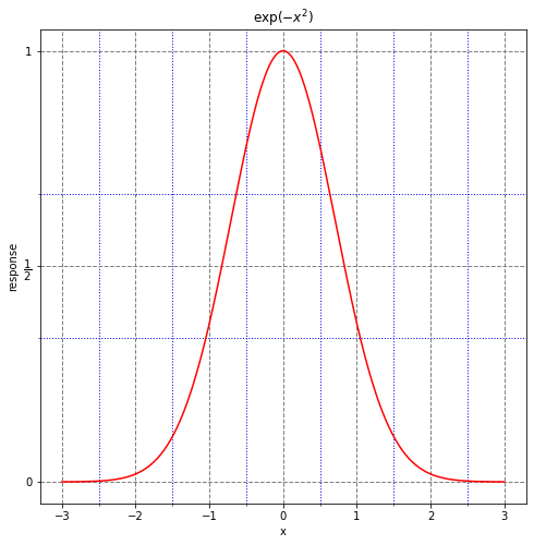
You can also impose a grid on the axes
fig, ax = plt.subplots(figsize=(8,8))
ax.plot(x, f(x), c='r')

ax.xaxis.set_minor_locator(MultipleLocator(0.5))# minor ticks are multiples of 0.5 on X-axis

ax.yaxis.set_major_locator(FixedLocator((0,0.5,1))) # set major tick labels manually
ax.yaxis.set_major_formatter(FixedFormatter(('0', r'$\dfrac{1}{2}$', '1')))
ax.yaxis.set_minor_locator(FixedLocator((1/3, 2/3)))

ax.grid(which='major', color=(0.5,0.5,0.5,0.2), linestyle='--', linewidth=1)
ax.grid(which='minor', color=(0,0,0.9,0.2), linestyle=':', linewidth=1)

ax.set_xlabel('x')
ax.set_ylabel('response')
ax.set_title(r'$\exp(-x^2)$') # note LaTeX string

plt.show(fig)
Plotting
We’ll cover a few extra tidbits about plotting
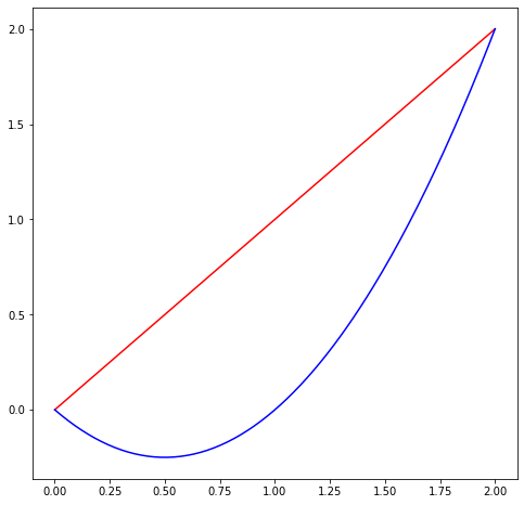
Color
There are a variety of ways you can specify colors. See the demo for several examples.
fs = [
    lambda x : x,
    lambda x : x * (x - 1)
]


fig, ax = plt.subplots(figsize=(8,8))

x = np.linspace(0, 2, 200)

ax.plot(x, fs[0](x), c='r')
ax.plot(x, fs[1](x), c='b')


plt.show(fig)
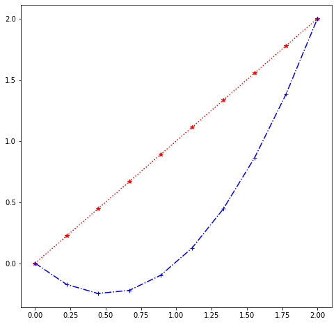
Plot Format
The first two arguments to plot are arrays x, y. The third (optional) arugment is a format string. You can specify color, marker type, and line style in this string.
color: supported abbreviations are
b,g,r,c,m,y,k,wmarkers: also single character abbreviations (see
help(plt.plot)for full list)line style:
-,--,-., and:
help(plt.plot)
Help on function plot in module matplotlib.pyplot:

plot(*args, scalex=True, scaley=True, data=None, **kwargs)
    Plot y versus x as lines and/or markers.

    Call signatures::

        plot([x], y, [fmt], *, data=None, **kwargs)
        plot([x], y, [fmt], [x2], y2, [fmt2], ..., **kwargs)

    The coordinates of the points or line nodes are given by *x*, *y*.

    The optional parameter *fmt* is a convenient way for defining basic
    formatting like color, marker and linestyle. It's a shortcut string
    notation described in the *Notes* section below.

    >>> plot(x, y)        # plot x and y using default line style and color
    >>> plot(x, y, 'bo')  # plot x and y using blue circle markers
    >>> plot(y)           # plot y using x as index array 0..N-1
    >>> plot(y, 'r+')     # ditto, but with red plusses

    You can use `.Line2D` properties as keyword arguments for more
    control on the appearance. Line properties and *fmt* can be mixed.
    The following two calls yield identical results:

    >>> plot(x, y, 'go--', linewidth=2, markersize=12)
    >>> plot(x, y, color='green', marker='o', linestyle='dashed',
    ...      linewidth=2, markersize=12)

    When conflicting with *fmt*, keyword arguments take precedence.


    **Plotting labelled data**

    There's a convenient way for plotting objects with labelled data (i.e.
    data that can be accessed by index ``obj['y']``). Instead of giving
    the data in *x* and *y*, you can provide the object in the *data*
    parameter and just give the labels for *x* and *y*::

    >>> plot('xlabel', 'ylabel', data=obj)

    All indexable objects are supported. This could e.g. be a `dict`, a
    `pandas.DataFame` or a structured numpy array.


    **Plotting multiple sets of data**

    There are various ways to plot multiple sets of data.

    - The most straight forward way is just to call `plot` multiple times.
      Example:

      >>> plot(x1, y1, 'bo')
      >>> plot(x2, y2, 'go')

    - Alternatively, if your data is already a 2d array, you can pass it
      directly to *x*, *y*. A separate data set will be drawn for every
      column.

      Example: an array ``a`` where the first column represents the *x*
      values and the other columns are the *y* columns::

      >>> plot(a[0], a[1:])

    - The third way is to specify multiple sets of *[x]*, *y*, *[fmt]*
      groups::

      >>> plot(x1, y1, 'g^', x2, y2, 'g-')

      In this case, any additional keyword argument applies to all
      datasets. Also this syntax cannot be combined with the *data*
      parameter.

    By default, each line is assigned a different style specified by a
    'style cycle'. The *fmt* and line property parameters are only
    necessary if you want explicit deviations from these defaults.
    Alternatively, you can also change the style cycle using
    :rc:`axes.prop_cycle`.


    Parameters
    ----------
    x, y : array-like or scalar
        The horizontal / vertical coordinates of the data points.
        *x* values are optional and default to `range(len(y))`.

        Commonly, these parameters are 1D arrays.

        They can also be scalars, or two-dimensional (in that case, the
        columns represent separate data sets).

        These arguments cannot be passed as keywords.

    fmt : str, optional
        A format string, e.g. 'ro' for red circles. See the *Notes*
        section for a full description of the format strings.

        Format strings are just an abbreviation for quickly setting
        basic line properties. All of these and more can also be
        controlled by keyword arguments.

        This argument cannot be passed as keyword.

    data : indexable object, optional
        An object with labelled data. If given, provide the label names to
        plot in *x* and *y*.

        .. note::
            Technically there's a slight ambiguity in calls where the
            second label is a valid *fmt*. `plot('n', 'o', data=obj)`
            could be `plt(x, y)` or `plt(y, fmt)`. In such cases,
            the former interpretation is chosen, but a warning is issued.
            You may suppress the warning by adding an empty format string
            `plot('n', 'o', '', data=obj)`.

    Other Parameters
    ----------------
    scalex, scaley : bool, optional, default: True
        These parameters determined if the view limits are adapted to
        the data limits. The values are passed on to `autoscale_view`.

    **kwargs : `.Line2D` properties, optional
        *kwargs* are used to specify properties like a line label (for
        auto legends), linewidth, antialiasing, marker face color.
        Example::

        >>> plot([1, 2, 3], [1, 2, 3], 'go-', label='line 1', linewidth=2)
        >>> plot([1, 2, 3], [1, 4, 9], 'rs', label='line 2')

        If you make multiple lines with one plot command, the kwargs
        apply to all those lines.

        Here is a list of available `.Line2D` properties:

        Properties:
        agg_filter: a filter function, which takes a (m, n, 3) float array and a dpi value, and returns a (m, n, 3) array
        alpha: float or None
        animated: bool
        antialiased or aa: bool
        clip_box: `.Bbox`
        clip_on: bool
        clip_path: Patch or (Path, Transform) or None
        color or c: color
        contains: callable
        dash_capstyle: {'butt', 'round', 'projecting'}
        dash_joinstyle: {'miter', 'round', 'bevel'}
        dashes: sequence of floats (on/off ink in points) or (None, None)
        data: (2, N) array or two 1D arrays
        drawstyle or ds: {'default', 'steps', 'steps-pre', 'steps-mid', 'steps-post'}, default: 'default'
        figure: `.Figure`
        fillstyle: {'full', 'left', 'right', 'bottom', 'top', 'none'}
        gid: str
        in_layout: bool
        label: object
        linestyle or ls: {'-', '--', '-.', ':', '', (offset, on-off-seq), ...}
        linewidth or lw: float
        marker: marker style
        markeredgecolor or mec: color
        markeredgewidth or mew: float
        markerfacecolor or mfc: color
        markerfacecoloralt or mfcalt: color
        markersize or ms: float
        markevery: None or int or (int, int) or slice or List[int] or float or (float, float)
        path_effects: `.AbstractPathEffect`
        picker: float or callable[[Artist, Event], Tuple[bool, dict]]
        pickradius: float
        rasterized: bool or None
        sketch_params: (scale: float, length: float, randomness: float)
        snap: bool or None
        solid_capstyle: {'butt', 'round', 'projecting'}
        solid_joinstyle: {'miter', 'round', 'bevel'}
        transform: `matplotlib.transforms.Transform`
        url: str
        visible: bool
        xdata: 1D array
        ydata: 1D array
        zorder: float

    Returns
    -------
    lines
        A list of `.Line2D` objects representing the plotted data.

    See Also
    --------
    scatter : XY scatter plot with markers of varying size and/or color (
        sometimes also called bubble chart).

    Notes
    -----
    **Format Strings**

    A format string consists of a part for color, marker and line::

        fmt = '[marker][line][color]'

    Each of them is optional. If not provided, the value from the style
    cycle is used. Exception: If ``line`` is given, but no ``marker``,
    the data will be a line without markers.

    Other combinations such as ``[color][marker][line]`` are also
    supported, but note that their parsing may be ambiguous.

    **Markers**

    =============    ===============================
    character        description
    =============    ===============================
    ``'.'``          point marker
    ``','``          pixel marker
    ``'o'``          circle marker
    ``'v'``          triangle_down marker
    ``'^'``          triangle_up marker
    ``'<'``          triangle_left marker
    ``'>'``          triangle_right marker
    ``'1'``          tri_down marker
    ``'2'``          tri_up marker
    ``'3'``          tri_left marker
    ``'4'``          tri_right marker
    ``'s'``          square marker
    ``'p'``          pentagon marker
    ``'*'``          star marker
    ``'h'``          hexagon1 marker
    ``'H'``          hexagon2 marker
    ``'+'``          plus marker
    ``'x'``          x marker
    ``'D'``          diamond marker
    ``'d'``          thin_diamond marker
    ``'|'``          vline marker
    ``'_'``          hline marker
    =============    ===============================

    **Line Styles**

    =============    ===============================
    character        description
    =============    ===============================
    ``'-'``          solid line style
    ``'--'``         dashed line style
    ``'-.'``         dash-dot line style
    ``':'``          dotted line style
    =============    ===============================

    Example format strings::

        'b'    # blue markers with default shape
        'or'   # red circles
        '-g'   # green solid line
        '--'   # dashed line with default color
        '^k:'  # black triangle_up markers connected by a dotted line

    **Colors**

    The supported color abbreviations are the single letter codes

    =============    ===============================
    character        color
    =============    ===============================
    ``'b'``          blue
    ``'g'``          green
    ``'r'``          red
    ``'c'``          cyan
    ``'m'``          magenta
    ``'y'``          yellow
    ``'k'``          black
    ``'w'``          white
    =============    ===============================

    and the ``'CN'`` colors that index into the default property cycle.

    If the color is the only part of the format string, you can
    additionally use any  `matplotlib.colors` spec, e.g. full names
    (``'green'``) or hex strings (``'#008000'``).
fig, ax = plt.subplots(figsize=(8,8))

x = np.linspace(0, 2, 10)

ax.plot(x, fs[0](x), '*r:')
ax.plot(x, fs[1](x), '+b-.')


plt.show(fig)
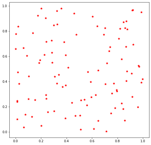
You can also format scatter plot markers with similar characters
fig, ax = plt.subplots(figsize=(8,8))

n = 100
x = np.random.rand(2, n)

ax.scatter(x[0], x[1], c='r', marker='*')


plt.show(fig)
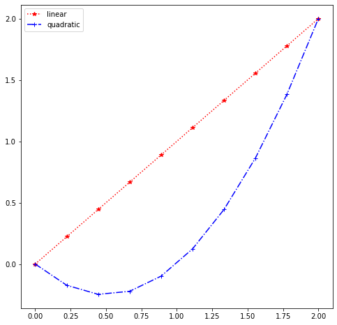
Legends
In order to use a legend, you should first label your line plots and scatter plots using label. By default, the legend will be placed in a region of the plot with some blank space
fig, ax = plt.subplots(figsize=(8,8))

x = np.linspace(0, 2, 10)

ax.plot(x, fs[0](x), '*r:', label='linear')
ax.plot(x, fs[1](x), '+b-.', label='quadratic')
ax.legend()


plt.show(fig)
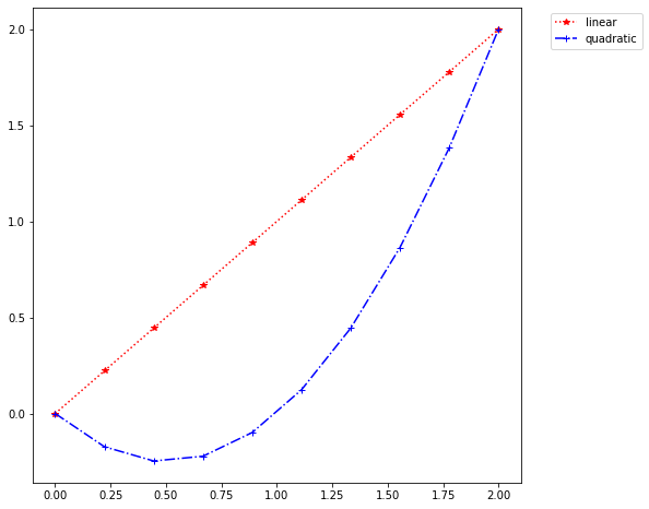
see help(plt.legend) for the many options you can use. One useful command can be used to place a legend outside the axis box:
fig, ax = plt.subplots(figsize=(8,8))

x = np.linspace(0, 2, 10)

ax.plot(x, fs[0](x), '*r:', label='linear')
ax.plot(x, fs[1](x), '+b-.', label='quadratic')
ax.legend(bbox_to_anchor=(1.05, 1), loc='upper left')


plt.show(fig)
Further Reading
Depending on what you are interested in doing, you may wish to dive into additional topics.
See the matplotlib tutorials to get started.
You can also read more about the API in the documentation